Case Study: ActiveBuilding
Interact with prototype
My Roles
UX Researcher & Designer
My Responsibilities
User Researcher, Wireframing, Persona Creation, Competitive Analysis, App Flow, Task Flow, Sketches, Low Fidelity, High Fidelity, and Prototyping.
Project Overview: Redesigning Four Screens of the ActiveBuilding App
The ActiveBuilding App is a platform that brings together residents, staff, and community amenities in one place. The app enables residents to manage their rent payments, communicate with neighbors and staff, reserve amenities, and access important community information on the go. The goal of this project is to redesign four screens of the ActiveBuilding App to improve the user experience and enhance its functionality.
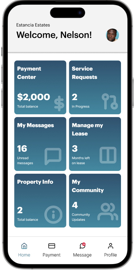
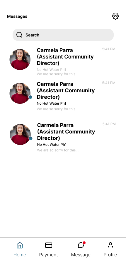
The four screens selected for redesign are the homepage, the Due Payment screen, the Make Payment screen, and the Payment History screen. These screens are critical to the app's functionality and require a user-friendly design to facilitate ease of use. The new design will focus on improving the app's usability, visual appeal, and overall functionality.
Competitive Analysis
To start the project, I conducted a competitive analysis to identify the pain points and areas of improvement for the chosen screens. Additionally, I obtained valuable feedback and insights from current users of the application. Utilizing the outcomes of this research, I will create user personas and use cases that will provide guidance for the app redesign.
Weakness
I had a horrible experience with my apartment management's utility bill and rent payment app. Despite being told that they are two different apps when I clicked on the link the utility service sent me, it took me to the page to pay my rent. This inconsistency needs to be addressed, and the option to choose what to pay (utility or rent) should be provided. Then, when I couldn't sign in, they charged me late fees for their mistake. When I contacted customer service, they told me that I had entered the wrong password, but how could I have entered it wrong if the app saved it?
In addition to these issues, the app is decent, but every time I try to make a one-time payment and choose not to save my bank information, it does so anyway. This has caused overdrafts and late fees because the app replaced my permanent payment method with a temporary one. I suggest that the app offer the option to save multiple bank accounts and nickname them to avoid these kinds of problems.
Strength
This app is awesome and very easy to use. Even if you are technologically challenged you should have no problem using this app. You can pay rent (and set up recurring payments if you wish), and view your current balance, so you know when your payment has been applied. Repair requests can be submitted with ease. The repair section allows you to submit photos, and you can view closed (completed) repairs. Two thumbs up.
Strength
Honestly, it’s super easy to use for making payments on my rent. It saves multiple forms of payment and is free if you are using electronic checks by giving them a checking account to draft from each month. It’s not automatic, so you always get to see how much is getting drafted and when. I appreciate that because sometimes my paychecks don’t always land on the first.
Persona
I developed a persona to represent the ideal user of the product. This helps us understand and relate to the user's needs and goals, and prioritize the most important features for them. It also guides our design decisions and ensures that the product is memorable and effective for our target audience. Utilizing personas can help create a more user-centered design approach.
App Flow
As a user, I want to be able to easily pay my bills in a timely manner.
Low-Fidelity
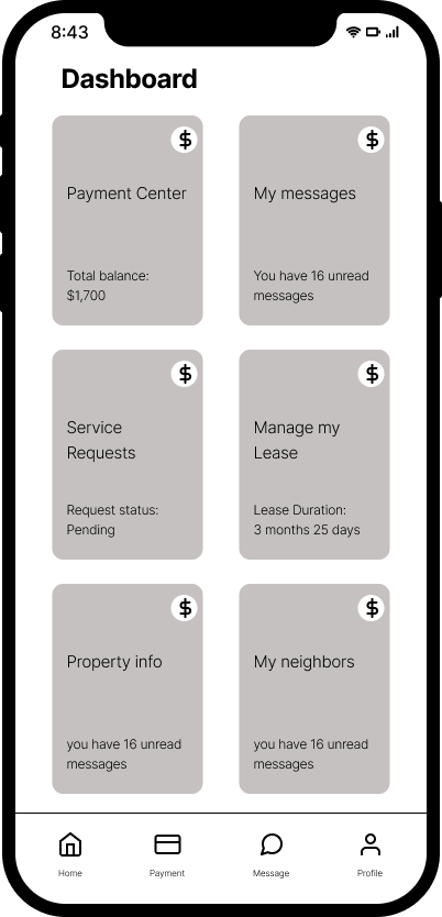
Next, I created mockups and wireframes of the redesigned screens, incorporating user feedback and best practices for mobile app design. The wireframes will be iterated until they accurately reflect the app's desired functionality and user experience.



High-Fidelity
Once the wireframes are finalized, I created high-fidelity mockups of the redesigned screens. These mockups showcase the new design elements, such as updated color schemes, typography, and iconography. I also ensure the new design is consistent with the ActiveBuilding brand.


Interactive Prototype
Before & After
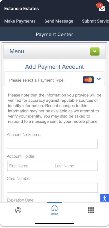
The previous version of the utility app lacked a clear hierarchy, which means users had difficulty understanding the relationships between different features or information. This made it challenging for users to navigate the app and find what they needed, especially since there were so many tabs to sort through.
In the redesigned app, I established a clear hierarchy, which creates a logical flow for users to follow. This hierarchy helps users easily understand the app's structure, locate information or features, and complete tasks. At the same time, I ensured the redesigned app was user-friendly, intuitive, and easy to use, with a streamlined navigation system.
Throughout the redesign process, I maintained consistency with the ActiveBuilding brand. I ensured the app's look and feel matched the brand's image and reputation. By doing so, I aimed to create a cohesive experience for users, who can now navigate the app with confidence and ease. Overall, the redesign has made the app more organized, user-friendly, and visually appealing, which should lead to increased engagement and user satisfaction.




Conclusion
The redesign of the four screens of the ActiveBuilding App focuses on the improvement of the user experience and enhancement of the app's functionality. Through user research, wireframing, and high-fidelity mockups, the new design is both aesthetically pleasing and intuitive to use. The project ultimately results in an app that is more user-friendly, efficient, and enjoyable for all users.
Next Step:
User Testing
Design More Screens
